E-learning in analysis of genomic and proteomic data 2. Data analysis 2.2. Analysis of high-density genomic data 2.2.1. DNA microarrays 2.2.1.6. Normalization
2.2.1.6.1. Why normalize?
All the lab-steps of microarray experiment from the design to the production of raw data file are source of technical bias to the raw data: the type of samples (fresh frozen or formalin fixed, tissues or blood samples...), microarray slide selection (cDNA, affymetrix...), DNA labelling (type of fluorescent label), hybridization, scanning and image analysis software. Hence, it is necessarry to check if the raw data are affected by some random or systematic errors. Normalization is a set of transformations that aim to eliminate this bias. How to find these errors and how to correct for them will be described in following sections. When normalizing, one have to keep in mind that there is not just unwanted technical variability we are trying to detect and eliminate, but there is also a biological variability we are trying to reveal and this should not be eliminated. The aim of normalization is to exclude the unwanted effects from the data and to make the data from different microarray slides comparable without worrying that the revealed significances are due to technical variation.
The normalization can be performed on within array level correcting for technical bias inside each array and on between array level correcting for distributional differences between different arrays from our experiment. There are various types of technical bias, each having special methods of dealing with it. Next section describes the methods of identification the types of present bias in the data.
2.2.1.6.2. Diagnostic plots
The very first part of normalization is the identification of the bias. The best way is to visualize them in diagnostic plots. Here we will discuss situation for two channel cDNA arrays, situation with other types are similar and most of mentioned plots and methods can be used.
The most intuitive way how to reveal the dye bias is scatterplot comparing both single channel intensities - the red dye and green dye. If points are equally distributed around the diagonal, than there is no dye bias:
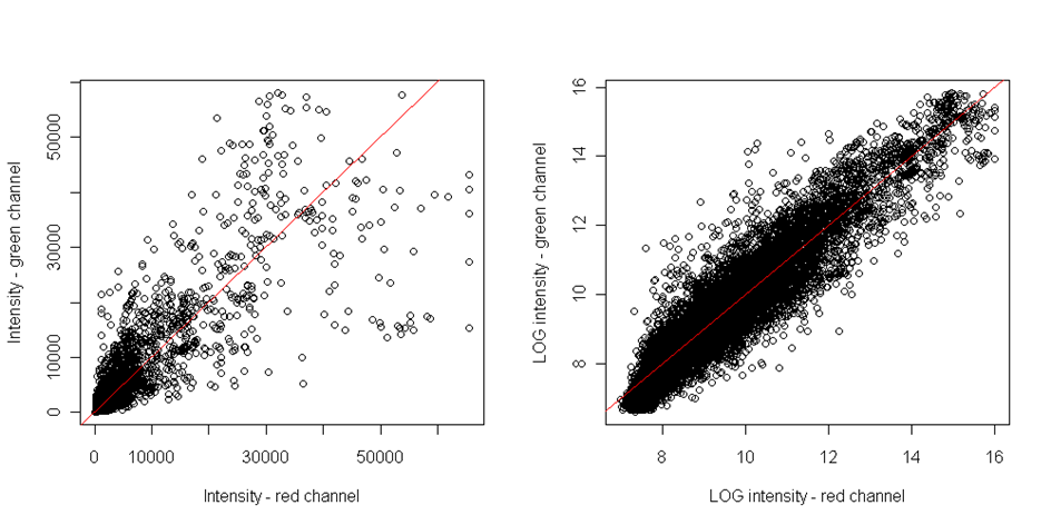
However, this plot is able to reveal only the linear dependence. However, the dye bias if often non-linear. To reveal the nonlinear relationship, the MA plot should be plotted. It is the scatterplot of M-values on axis x and A-values on axis y. Where M and A values are defined as follows
![]() and
and ![]()
where R and G represent the red and green channel intensities respectively. In many experiments, the general assumption is that the majority of genes does not reveal any difference in gene expression between groups. Thus the majority of points should be distributed on the y axis around zero if there is no difference in dye intensities:

Clearly, the MA plot reveals the nonlinear dependencies.
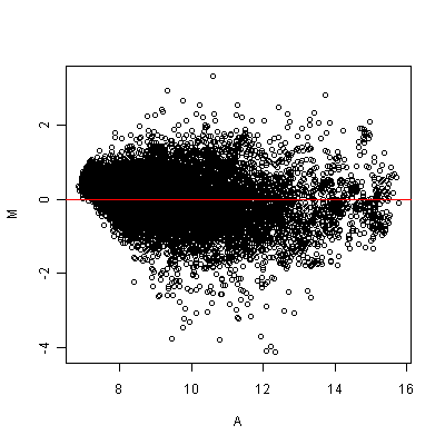
Figure: MA plot
Spatial patterns can be visualized for both foreground and background intensities, in the form of log2 ratio values by plotting the heatmap. It is a graph of intensities of each spot arranged according to their position on microarray slide:
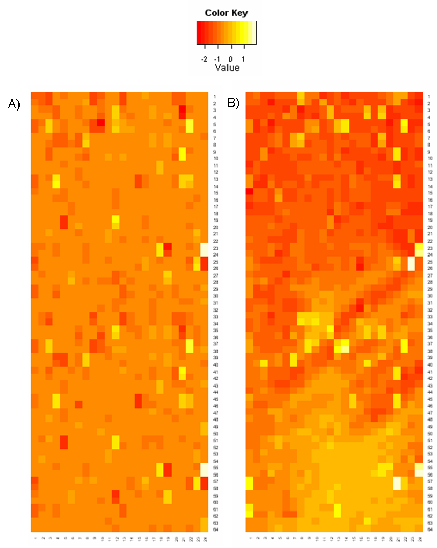
Figure: Heat maps of log2ratio values: A) Array without any spatial bias; B) Array with systematic bias distortion
The above heatmap shows foreground log2ratios and is plotted in a color scale from red through yellow to white, where red means, that the gene is active just in one channel and white means that the gene is active in the second one. Yellow means, that the intensities are equal in both channels. Each gene is depicted with colour according to the log2ratio.
If there is no spatial bias, the colours should be spread over the array randomly without any visible patterns. This graph can reveal any spatial bias, - see the above heatmap on the right.
It is worthy to plot the heatmap for background intensities.
Another useful diagnostic tool is to plot boxplots. By means of boxplot we can check overall intensity either between single print tips within each array or intensities bettwen arrays. After normalization, the mean intensity and scale between print tips should be comparable as well aoverall intensity among all arrays.
Each normalization should be checked by visualizing the intensities before and after the transformation.
2.2.1.6.3. Within array normalization
Within array normalization aims to adjust for technical variability inside an array. The basic assumption for all normalization methods is that most of genes within whole array do not change in expression and the intensity ratio can be assumed to be one. This assumption can be applied for arrays with large number of genes. So if there are just few hundreds we should be more careful with normalization. The normalization should be done in order we propose here.
cDNA arrays
Spatial bias normalization
First of all we should focus on correction of spatial bias. Often this is caused by uneven hybridization, such problem can be visualized on heatmap as lighter or darker areas in middle or on the edges. Another cause of spatial bias can be the print tip problem. The probes on microarray slides are usually printed with a set of small number of pins, each of them creating a rectangle of spots on the array called print-tip. If any of these pins is damaged in some way, the corresponding print-tip spots may differ in hybridization from the rest. On the other hand, there are situations in which the heatmap shows obvious spatial patterns, but it’s not desirable to normalize them. Even when it is recommended to distribute genes randomly on the array, if for some reason the microarray slide has genes arranged according to their biological function, it can create evident patterns on the heatmap. Such patterns should not be normalized. Often, the control spots are plotted onto array in a regular manner in order to control for any spatial bias. These spots can contain spike controls, housekeeping genes or no probes at all.
Another reason of spatial bias can be uneven chip washing or inserting the chip wrongly in the scanner what causes the uneven fluorscence intensity across the array.
One of the best methods to eliminate spatial bias is the lowess or loess regression.If a linear function is used to estimate trend with local regression, then it is called lowess. If a quadratic function is applied, we talk about loess regression. The loess function is applied to the data in stepwise manner to estimate local trends by sliing window method. This result in smoothed curve that should reveal the hidden trend. The estimated curve is then subtracted from original values.
Background normalization
Background normalization should follow the spatial normalization. There is always some redundant fluorescence in the area between spots and it is then crucial to remove it from the real spot foreground intensities.
If we suppose, that this background effect is additive, then observed spot intensities thebe sum of the backround intensity and the true signal so the simplest approach is to subtract background signal (noise) from observed signal to estimate the true signal. But there is a risk of getting negative intensities. For example, if the grid during image analysis did not fit each spot with the maximal accuracy, then the background signal can be biased with pixels which originally belong to the spot foreground. In such cases the background intensities may be even higher than foreground and there is no logical explanation for negative intensities. This problem may be fixed by subtracting mean of all empty spots on the array, instead of local backgrounds.
However, some authors consider that the effect of background is not aditive and some authors consider that the background should not be extracted from the spot foreground signal at all.
Dye bias normalization
The third step in normalization within array should be the dye effect correction. Current cDNA microarray technology uses two different dyes to distinguish the samples. Although, these two dyes have much in common, there are slight differences which can make the direct comparison impossible. The first one is different affinity of the dye molecules onto DNA and the second one is the difference in excitation by UV scanner. Differences in dye labeling are the most common source of bias, but on the other hand it is also easily identifiable. One way how to deal with this problem is the dye swap design. However, this requires twice the number of arrays what is quite expensive, mainly when there are statistical methods that can adjust for these differences.
The smoothing of the data is performed on the data of previously presented MA scatter plot. Primarily the line of equal expression is estimated. The question is which data we should use for this estimation. Usually we use the invariant set of control spots, like houskeeping genes, which are expected to have similar expression across the groups. Problem is that the control spots are not present on each array or their number is too small for a regression. Under the assumption of majority of genes having constant expression across all the clinical groups we are about to compare we can estimate this curve from all genes on the array. There are several methods for estimation of the curve, for example we can use loess regression again, or there are methods based on splines.
Similarly as in spatial normalization, the estimated curve is then subtracted from original values and the effect of normalization is checked on before/after diagnostic plots:
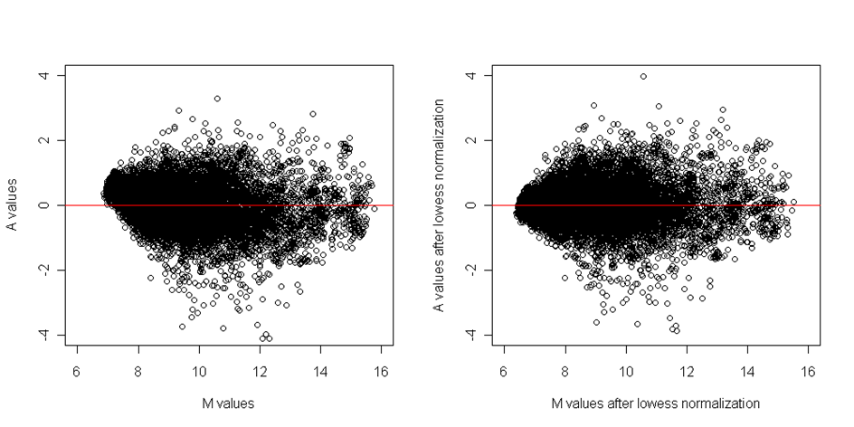
Figure: MA plots before and after dye normalization
As we mentioned at the beginning of this section, the normalization steps should be applied in the presented order. If we'd applly the dye normalization before the spatial normalization, the spatial effects can seriously bias the dye effect and this can lead to inconsistencies.
2.2.1.6.4. Between array normalization
Although all arrays are scanned with the same scanner and we have corrected for technical vias within each array, the distributions of signal intensities between arrays is not the same. This is, indeed, a result of biological differences between samples but mainly the result of different amount of mRNA and slightly different sample handling even when the process in the laboratory is well standardized. The comparability of intensities between arrays can be achieved by between array normalization. During this normalization, we try to align the distribution of intensities of all arrays by centering medians and adjusting scale to the same value.
This type of normalization can account for the groups (conditions) we are about to compare, mostly when we expect significant differences between the compared groups. In normalization within conditions, we normalize arrays with replicated samples under the same condition (in the same group) and during the normalization across conditions, the arrays are normalized between groups. When applying the latter normalization, we have to be careful not to eliminate the biological variability.
One of the best methods for this purpose is the quantile normalization. This method can normalize both types of replicates and align them onto the same scale. It is based on ranks of observations so there are no assumptions on the distribution of the data. First the rank based normalization is performed on the subgroup of invariant genes and then the remaining spots intensities are estimated by linear interpolation. The median and scales of intensities of normalized arrays can be compared by plotting the boxplots:
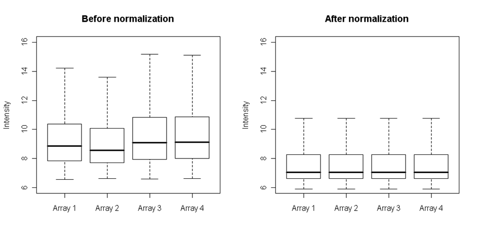
Figure: Four arrays before and after quantile normalization